GATEBREAKER
TyTy's log
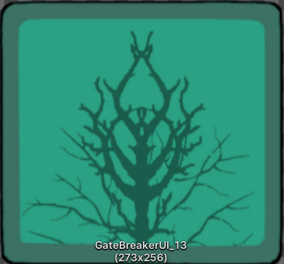
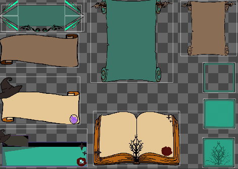
These are some base designs I had in the beginning of the UI design process. I have come a bit far now understanding that design must be easier on the eyes and smoother not just rough straight lines. They started on paper then moved to scanning and coloring it using Krita artistic software. These designs were later scrapped and editied. For the inventory system the witchy symbolic tree is used in the background. Also icons for the sap and branches had to be changed to be smaller and comphrehensible. Instead of just a paint splat honey amber colored was a nice touch but something seemed to be missing. Thoughts on adding a tree trunk or bowl???? All of the whites had to be changed to off white to keep users' eyes from straining. Pearl, offwhite and beidgishwhite colors work best (keeping in mind dark mode and eye strain & color theory). This process is far from over.
Get GATEBREAKER
GATEBREAKER
| Status | In development |
| Authors | MOLFOX, RACcomputing, Spikeddragon, FlowerBear, AnotherRose |
| Genre | Action, Platformer |
| Tags | Meaningful Choices, Metroidvania |
More posts
- Marcy Devlog 6Dec 05, 2023
- Marcy Devlog 5Dec 05, 2023
- Marcy Devlog 4Dec 05, 2023
- Ro Devlog 4Nov 29, 2023
- Ro Devlog 3Nov 29, 2023
- Ro Devlog 2Nov 29, 2023
- Ro Devlog 1Nov 29, 2023
- TyTy's logNov 29, 2023
- TyTy's logNov 28, 2023
Leave a comment
Log in with itch.io to leave a comment.